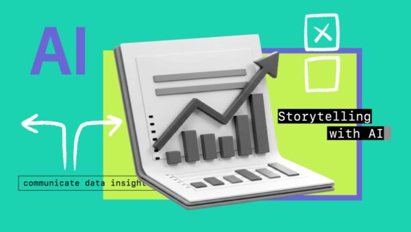
Course Overview
Learn how to design clear, focused charts that highlight key insights and help audiences quickly understand what the data means and why it matters to them. This course covers practical principles for turning data visualizations into clear visuals that communicate insights effectively, including choosing the right chart types, simplifying visuals, and structuring slides to convey a single clear message.
Key Takeaways
- Understand the difference between exploratory and explanatory charts.
- Learn how to choose the best chart type for your message.
- Discover techniques to simplify visuals and emphasize key information.
- Use titles, annotations, and visual hierarchy to highlight important insights.
- Structure slides to communicate clear messages with appropriate context and implications.
Target Learners
This course is designed for professionals who want to improve their ability to communicate data insights clearly and effectively through visualization and storytelling, especially those with an intermediate skill level.
- 1 Why clarity matters even more in the age of AI 58s
- 2 Exploratory vs. explanatory charts 2m 31s
- 3 Framework to create explanatory charts 2m 14s
- 1 Identifying your insight 2m 9s
- 2 Demo: Using AI to generate insights from data 6m 52s
- 3 Deciding what to visualize 2m 12s
- 1 Before you chart: When to use text or tables 2m 27s
- 2 Starting with chart categories 2m 20s
- 3 Vsualizing trends 2m 49s
- 4 Visualizing comparisons 3m 14s
- 5 Visualizing part-to-whole relationships 4m 45s
- 6 Demo: Using AI to explore chart options 6m 18s
- 1 Why clutter hurts comprehension 1m 20s
- 2 Maximizing the data-ink ratio 4m 22s
- 3 Direct labeling 3m 15s
- 4 Demo: Using color intentionally 4m 49s
- 5 Activity: Simplify your visuals 5m 26s
- 1 Why your chart needs more than good design 2m 34s
- 2 Writing active titles 4m 6s
- 3 Adding context with benchmarks and reference lines 3m 26s
- 4 Using annotations 2m 43s
- 5 Activity: Amplify your message 3m 28s
- 6 Demo: Using AI to critique a chart 2m 1s
- 1 Connecting charts into a clear narrative 2m 51s
- 2 Keep the momentum 40s
Access Files No pi required.
Free Course files 1 file package
- Linkedin - Data Visualization and Storytelling with AI: Design Visuals That Drive Better Decisions
Discussions are closed
Comments are currently disabled for this course.